Responsive website example
Mobile Friendly (Responsive) Example Area:


This area has a photo that changes based on the device size. This is done by showing and hiding images.
 This area has a photo that changes based on the device size. This is done by showing and hiding images.
 This area has a photo that changes based on the device size. This is done by showing and hiding images.
 This area has a photo that changes based on the device size. This is done by showing and hiding images.
Watch a Responsive Website at work
Responsive Websites are Mobile Friendly This entire website is a responsive website. A responsive website has the ability to move content around, grow, shrink, show, and hide elements based on the size and type of device viewing it. In this area we will exaggerate the responsive capabilities just to demonstrate some of its key features. Factxback.com recommends to our clients the use of responsive websites. They are mobile friendly and they are adaptive. Google rewards sites that pass the mobile friendly testing.
The image below was set to always be 75% of the screen area

The above image was set to always be 75% of the screen area. The above image is a stock photo. We often purchase royalty free, stock photos for a more professional look. By licensing the images you are not likely to be sued for royalty infringements.

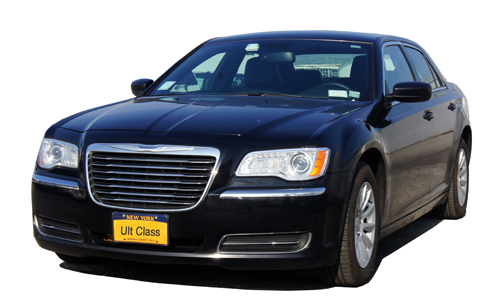
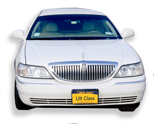
Notice how the long limo goes from 1/2 the page on the upper line. The limo is defined as 45% of the page since it is a longer photo. This gives it prospective compared to the cars next to it. The limo changes to full page almost right away.
 This Limo will Start as top middle, it moves to the second row on the left and finishes on its own line.

This limo starts in the upper right, moves to the upper right of the second row and finishes on its own line.
Robert Kothe, AHWD, C2EX - NYS Licensed Real Estate Salesperson / InternetMadeEz.com / WebsitesVideo.com
Phone (631) 427-3292 email Robert@factxback.com / RKothe@signaturePremier.com
© 2023 www.InternetMadeEZ.com